
Components
Header
A header helps users identify where they are and provides a quick, organized way to reach the main sections of a website.
Passed WCAG 2.1 AA
When to use a header component
- Most websites require header navigation. Most websites require some form of navigation to help users find the information they need. While a horizontal navigation bar is just one option for navigation design, it is one of the most visible and familiar ways of helping users navigate a site.
Header usability
- List all important website sections as links in the horizontal navigation.
- Dropdown menus help preview lower-level content. For large websites, use dropdown menus to help users preview lower-level content. If lower-level sections are closely related and users will need to quickly jump between them, consider using a side navigation instead of — or in addition to — a dropdown.
- Use short, clear link labels. Don’t use jargon or unfamiliar terms.
- Left-justify. Left-justified link labels are more easily scannable.
- Present links in priority order. Higher-demand links should appear farther to the left, and lower-demand links should appear farther to the right.
- Avoid org-structure navigation. Don’t model your navigation after your agency’s org structure. Instead, structure it according to the tasks and information your users most frequently need to access.
- Highlight the current section. Show users where they are within the site by highlighting the current section.
- Always research your navigation. Conduct research with your users, and base decisions about your site’s information architecture and navigation structure on your findings. Continue researching to confirm that updates meet your users’ needs.
Header accessibility
-
Add a skip navigation link before the header. Include skip navigation links to allow those using
screen readers to bypass long navigation lists. Make sure you include an
idat the beginning of your main content and that it matches the skip navigation link. Find more information on skip navigation links at WebAIM. -
Ensure your horizontal navigation is keyboard compatible. Test to make sure
users can use
Tabto navigate andSpace(orEnter) to open pages. - Include tab focus for all top-level navigation navigation items. This feature will allow keyboard-reliant users to easily navigate interactive items.
- Avoid using hover to expand dropdown lists. Hover is difficult for some users and won't work on touch screens. Dropdowns should expand on click or with keyboard navigation.
-
Add context by labelling your nav element. If your page has more than one
navelement, use thearia-labelattribute to help assistive technology users understand the purpose of the navigation. - Use list elements for your navigation links. This helps screen reader users navigate header content.
- Add alt text to your logo image. If you’re using a logo that’s an image rather than text, make sure you include alternative text for screen readers.
-
Don't use an H1 for your logo. If you’re using a logo that’s text, use an
em, not anh1, unless it’s the homepage. Find more information here: http://csswizardry.com/2010/10/your-logo-is-an-image-not-a-h1/.
Further reading
Implementation
Header settings
| Variable | Description |
|---|---|
$theme-header-font-family
|
Font family of the header. |
$theme-header-logo-text-width
|
Width of the logo text area at desktop width as a percentage of the total header width. |
$theme-header-max-width
|
Maximum width of the header. |
$theme-header-min-width
|
Breakpoint at which the non-mobile header is shown. |
Header variants
| Variant | Description |
|---|---|
|
|
Display a simple header. |
|
|
Display a megamenu. |
|
|
Display an extended header. |
Note: We recommend loading uswds-init.js when using banner, header, or modal components to assist in preventing flashes of unstyled content (FOUC) as well as cumulative layout shift (CLS). This small JavaScript file (less than 1 KB minified) helps the browser know if the USWDS JavaScript library is loading properly.
To add uswds-init to your site, simply copy uswds-init.js into your site assets from either the uswds-core/src/js package or the dist/js directory in the downloadable package. Then, reference the file in the <head> of your HTML files. Alternatively, you can inline its contents directly into a <script> tag in your HTML files.
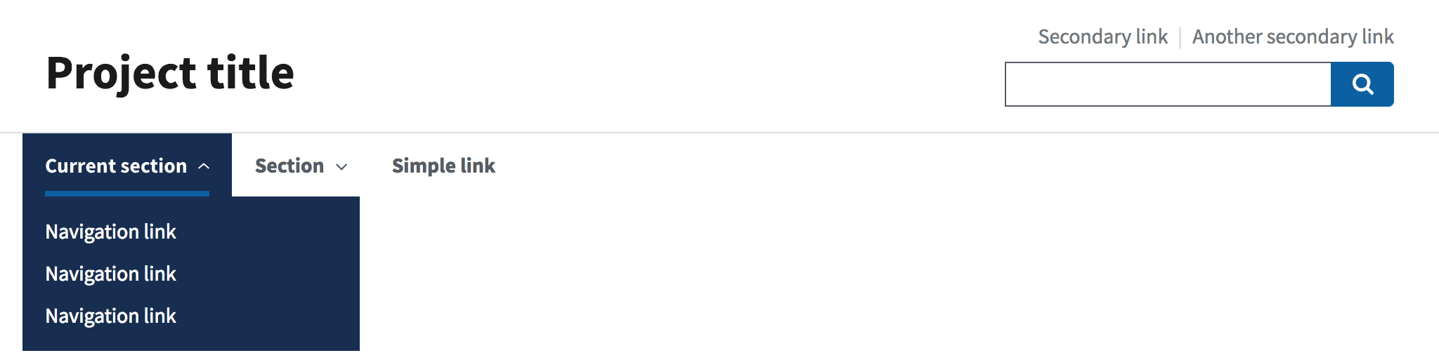
Basic header
Orient users to a simple site.

<div class="usa-overlay"></div>
<header class="usa-header usa-header--basic">
<div class="usa-nav-container">
<div class="usa-navbar">
<div class="usa-logo">
<em class="usa-logo__text"
><a href="/" title="<Project title>"><Project title></a></em
>
</div>
<button type="button" class="usa-menu-btn">Menu</button>
</div>
<nav aria-label="Primary navigation" class="usa-nav">
<button type="button" class="usa-nav__close">
<img src="/assets/img/usa-icons/close.svg" role="img" alt="Close" />
</button>
<ul class="usa-nav__primary usa-accordion">
<li class="usa-nav__primary-item">
<button
type="button"
class="usa-accordion__button usa-nav__link usa-current"
aria-expanded="false"
aria-controls="basic-nav-section-one"
>
<span><Current section></span>
</button>
<ul id="basic-nav-section-one" class="usa-nav__submenu">
<li class="usa-nav__submenu-item">
<a href="javascript:void(0);"
><span><Navigation link></span></a
>
</li>
<li class="usa-nav__submenu-item">
<a href="javascript:void(0);"
><span><Navigation link></span></a
>
</li>
<li class="usa-nav__submenu-item">
<a href="javascript:void(0);"
><span><Navigation link></span></a
>
</li>
<li class="usa-nav__submenu-item">
<a href="javascript:void(0);"
><span><Navigation link></span></a
>
</li>
</ul>
</li>
<li class="usa-nav__primary-item">
<button
type="button"
class="usa-accordion__button usa-nav__link"
aria-expanded="false"
aria-controls="basic-nav-section-two"
>
<span><Section></span>
</button>
<ul id="basic-nav-section-two" class="usa-nav__submenu">
<li class="usa-nav__submenu-item">
<a href="javascript:void(0);"
><span><Navigation link></span></a
>
</li>
<li class="usa-nav__submenu-item">
<a href="javascript:void(0);"
><span><Navigation link></span></a
>
</li>
<li class="usa-nav__submenu-item">
<a href="javascript:void(0);"
><span><Navigation link></span></a
>
</li>
</ul>
</li>
<li class="usa-nav__primary-item">
<a href="javascript:void(0);" class="usa-nav-link"
><span><Simple link></span></a
>
</li>
</ul>
<section aria-label="Search component">
<form class="usa-search usa-search--small" role="search">
<label class="usa-sr-only" for="search-field">Search</label>
<input
class="usa-input"
id="search-field"
type="search"
name="search"
/>
<button class="usa-button" type="submit">
<img
src="/assets/img/usa-icons-bg/search--white.svg"
class="usa-search__submit-icon"
alt="Search"
/>
</button>
</form>
</section>
</nav>
</div>
</header>Guidance
About
- Use the basic header if you have few enough sections in your main navigation to fit comfortably next to your logo; this decision will depend on the length of your text and whether you include a search bar. You can customize the header (depending on your site structure) and use it with:
- A text or image logo
- With or without dropdown menus
- With or without a search bar
- With or without call-to-action buttons in place of the search bar
When to use the basic header
- Limited sections. The basic header is great if you have a modest number of sections in your main navigation.
- Shallow hierarchy. You may also use it if each main section listed in the horizontal navigation has six or fewer subsections that you’d like to include in a dropdown menu.
When to consider something else
- Many sections or deep hierarchy. Consider using the extended header if you have more sections in your horizontal navigation than will fit comfortably next to your logo or if you have complex sections that require the use of a megamenu.
Package
-
Package usage:
@forward "usa-header"; - Dependencies:
uswds-fonts,uswds-helpers,usa-skipnav,usa-search,usa-button,usa-nav,usa-accordion
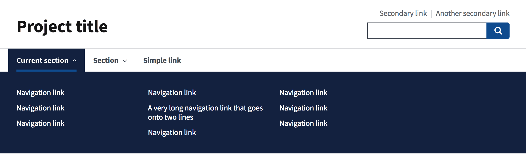
Basic header with megamenu
Orient users to a site with deeper hierarchical needs.

<div class="usa-overlay"></div>
<header class="usa-header usa-header--basic usa-header--megamenu">
<div class="usa-nav-container">
<div class="usa-navbar">
<div class="usa-logo">
<em class="usa-logo__text"
><a href="/" title="<Project title>"><Project title></a></em
>
</div>
<button type="button" class="usa-menu-btn">Menu</button>
</div>
<nav aria-label="Primary navigation" class="usa-nav">
<button type="button" class="usa-nav__close">
<img src="/assets/img/usa-icons/close.svg" role="img" alt="Close" />
</button>
<ul class="usa-nav__primary usa-accordion">
<li class="usa-nav__primary-item">
<button
type="button"
class="usa-accordion__button usa-nav__link usa-current"
aria-expanded="false"
aria-controls="basic-mega-nav-section-one"
>
<span><Current section></span>
</button>
<div
id="basic-mega-nav-section-one"
class="usa-nav__submenu usa-megamenu"
>
<div class="grid-row grid-gap-4">
<div class="usa-col">
<ul class="usa-nav__submenu-list">
<li class="usa-nav__submenu-item">
<a href="javascript:void(0);"><Navigation link></a>
</li>
<li class="usa-nav__submenu-item">
<a href="javascript:void(0);"><Navigation link></a>
</li>
<li class="usa-nav__submenu-item">
<a href="javascript:void(0);"><Navigation link></a>
</li>
</ul>
</div>
<div class="usa-col">
<ul class="usa-nav__submenu-list">
<li class="usa-nav__submenu-item">
<a href="javascript:void(0);"><Navigation link></a>
</li>
<li class="usa-nav__submenu-item">
<a href="javascript:void(0);"
><A very long navigation link that goes onto two
lines></a
>
</li>
<li class="usa-nav__submenu-item">
<a href="javascript:void(0);"><Navigation link></a>
</li>
</ul>
</div>
<div class="usa-col">
<ul class="usa-nav__submenu-list">
<li class="usa-nav__submenu-item">
<a href="javascript:void(0);"><Navigation link></a>
</li>
<li class="usa-nav__submenu-item">
<a href="javascript:void(0);"><Navigation link></a>
</li>
<li class="usa-nav__submenu-item">
<a href="javascript:void(0);"><Navigation link></a>
</li>
</ul>
</div>
</div>
</div>
</li>
<li class="usa-nav__primary-item">
<button
type="button"
class="usa-accordion__button usa-nav__link"
aria-expanded="false"
aria-controls="basic-mega-nav-section-two"
>
<span><Section></span>
</button>
<div
id="basic-mega-nav-section-two"
class="usa-nav__submenu usa-megamenu"
>
<div class="grid-row grid-gap-4">
<div class="usa-col">
<ul class="usa-nav__submenu-list">
<li class="usa-nav__submenu-item">
<a href="javascript:void(0);"><Navigation link></a>
</li>
<li class="usa-nav__submenu-item">
<a href="javascript:void(0);"><Navigation link></a>
</li>
<li class="usa-nav__submenu-item">
<a href="javascript:void(0);"><Navigation link></a>
</li>
</ul>
</div>
<div class="usa-col">
<ul class="usa-nav__submenu-list">
<li class="usa-nav__submenu-item">
<a href="javascript:void(0);"><Navigation link></a>
</li>
<li class="usa-nav__submenu-item">
<a href="javascript:void(0);"
><A very long navigation link that goes onto two
lines></a
>
</li>
<li class="usa-nav__submenu-item">
<a href="javascript:void(0);"><Navigation link></a>
</li>
</ul>
</div>
<div class="usa-col">
<ul class="usa-nav__submenu-list">
<li class="usa-nav__submenu-item">
<a href="javascript:void(0);"><Navigation link></a>
</li>
<li class="usa-nav__submenu-item">
<a href="javascript:void(0);"><Navigation link></a>
</li>
<li class="usa-nav__submenu-item">
<a href="javascript:void(0);"><Navigation link></a>
</li>
</ul>
</div>
<div class="usa-col">
<ul class="usa-nav__submenu-list">
<li class="usa-nav__submenu-item">
<a href="javascript:void(0);"><Navigation link></a>
</li>
<li class="usa-nav__submenu-item">
<a href="javascript:void(0);"><Navigation link></a>
</li>
<li class="usa-nav__submenu-item">
<a href="javascript:void(0);"><Navigation link></a>
</li>
</ul>
</div>
</div>
</div>
</li>
<li class="usa-nav__primary-item">
<a href="javascript:void(0);" class="usa-nav-link"
><Simple link></a
>
</li>
</ul>
<section aria-label="Search component">
<form class="usa-search usa-search--small" role="search">
<label class="usa-sr-only" for="search-field">Search</label>
<input
class="usa-input"
id="search-field"
type="search"
name="search"
/>
<button class="usa-button" type="submit">
<img
src="/assets/img/usa-icons-bg/search--white.svg"
class="usa-search__submit-icon"
alt="Search"
/>
</button>
</form>
</section>
</nav>
</div>
</header>Guidance
About
The basic header with a megamenu is similar in design to the basic header component. The megamenu allows for the inclusion of more links in dropdown menus. You can customize this header (depending on your site structure) and use it with:
- A text or image logo
- With or without a search bar
- With or without call-to-action buttons in place of the search bar
When to use the basic header with megamenu
- Deep hierarchy. Use the basic header with a megamenu if you’d like to include more than six links in any of your dropdown menus and if you have few enough main sections to allow your horizontal navigation to fit comfortably in the basic header.
When to consider something else
- Not enough content to warrant a megamenu. Consider using a basic dropdown, rather than a megamenu, unless you need to link to a large number of sub-pages.
Package
-
Package usage:
@forward "usa-header"; - Dependencies:
uswds-fonts,uswds-helpers,usa-skipnav,usa-search,usa-button,usa-nav,usa-accordion
Extended header
Orient users to a site with lots of sections.
<div class="usa-overlay"></div>
<header class="usa-header usa-header--extended">
<div class="usa-navbar">
<div class="usa-logo">
<em class="usa-logo__text"
><a href="/" title="<Project title>"><Project title></a></em
>
</div>
<button type="button" class="usa-menu-btn">Menu</button>
</div>
<nav aria-label="Primary navigation" class="usa-nav">
<div class="usa-nav__inner">
<button type="button" class="usa-nav__close">
<img src="/assets/img/usa-icons/close.svg" role="img" alt="Close" />
</button>
<ul class="usa-nav__primary usa-accordion">
<li class="usa-nav__primary-item">
<button
type="button"
class="usa-accordion__button usa-nav__link usa-current"
aria-expanded="false"
aria-controls="extended-nav-section-one"
>
<span><Current section></span>
</button>
<ul id="extended-nav-section-one" class="usa-nav__submenu">
<li class="usa-nav__submenu-item">
<a href="javascript:void(0);"
><span><Navigation link></span></a
>
</li>
<li class="usa-nav__submenu-item">
<a href="javascript:void(0);"
><span><Navigation link></span></a
>
</li>
<li class="usa-nav__submenu-item">
<a href="javascript:void(0);"
><span><Navigation link></span></a
>
</li>
<li class="usa-nav__submenu-item">
<a href="javascript:void(0);"
><span><Navigation link></span></a
>
</li>
</ul>
</li>
<li class="usa-nav__primary-item">
<button
type="button"
class="usa-accordion__button usa-nav__link"
aria-expanded="false"
aria-controls="extended-nav-section-two"
>
<span><Section></span>
</button>
<ul id="extended-nav-section-two" class="usa-nav__submenu">
<li class="usa-nav__submenu-item">
<a href="javascript:void(0);"
><span><Navigation link></span></a
>
</li>
<li class="usa-nav__submenu-item">
<a href="javascript:void(0);"
><span><Navigation link></span></a
>
</li>
<li class="usa-nav__submenu-item">
<a href="javascript:void(0);"
><span><Navigation link></span></a
>
</li>
</ul>
</li>
<li class="usa-nav__primary-item">
<a href="javascript:void(0);" class="usa-nav-link"
><span><Simple link></span></a
>
</li>
</ul>
<div class="usa-nav__secondary">
<ul class="usa-nav__secondary-links"></ul>
<section aria-label="Search component">
<form class="usa-search usa-search--small" role="search">
<label class="usa-sr-only" for="search-field">Search</label>
<input
class="usa-input"
id="search-field"
type="search"
name="search"
/>
<button class="usa-button" type="submit">
<img
src="/assets/img/usa-icons-bg/search--white.svg"
class="usa-search__submit-icon"
alt="Search"
/>
</button>
</form>
</section>
</div>
</div>
</nav>
</header>Guidance
About
An extended header allows for the inclusion of more sections in a horizontal navigation. You can customize the header (depending on your site structure) and use it:
- With a text or image logo
- With or without dropdown menus
- With or without the expandable search bar
- With or without call-to-action buttons in place of the secondary links featured in your horizontal navigation
When to use the extended header
- Lots of sections. Use the extended header if you have too many sections in your horizontal navigation to fit comfortably in the basic header format.
- Secondary links or specific calls to action. Use the extended header if you’d like to include secondary links or specific calls to action in addition to the main content navigation — for example
Log inandSign uplinks.
When to consider something else
- Simple site needs. Consider using the basic header if you have less information — the basic header takes up less space.
Package
-
Package usage:
@forward "usa-header"; - Dependencies:
uswds-fonts,uswds-helpers,usa-skipnav,usa-search,usa-button,usa-nav,usa-accordion
Extended header with megamenu
Orient users to a site with lots of sections and deeper hierarchical needs.
<div class="usa-overlay"></div>
<header class="usa-header usa-header--extended">
<div class="usa-navbar">
<div class="usa-logo">
<em class="usa-logo__text"
><a href="/" title="<Project title>"><Project title></a></em
>
</div>
<button type="button" class="usa-menu-btn">Menu</button>
</div>
<nav aria-label="Primary navigation" class="usa-nav">
<div class="usa-nav__inner">
<button type="button" class="usa-nav__close">
<img src="/assets/img/usa-icons/close.svg" role="img" alt="Close" />
</button>
<ul class="usa-nav__primary usa-accordion">
<li class="usa-nav__primary-item">
<button
type="button"
class="usa-accordion__button usa-nav__link usa-current"
aria-expanded="false"
aria-controls="extended-mega-nav-section-one"
>
<span><Current section></span>
</button>
<div
id="extended-mega-nav-section-one"
class="usa-nav__submenu usa-megamenu"
>
<div class="grid-row grid-gap-4">
<div class="usa-col">
<ul class="usa-nav__submenu-list">
<li class="usa-nav__submenu-item">
<a href="javascript:void(0);"><Navigation link></a>
</li>
<li class="usa-nav__submenu-item">
<a href="javascript:void(0);"><Navigation link></a>
</li>
<li class="usa-nav__submenu-item">
<a href="javascript:void(0);"><Navigation link></a>
</li>
</ul>
</div>
<div class="usa-col">
<ul class="usa-nav__submenu-list">
<li class="usa-nav__submenu-item">
<a href="javascript:void(0);"><Navigation link></a>
</li>
<li class="usa-nav__submenu-item">
<a href="javascript:void(0);"
><A very long navigation link that goes onto two
lines></a
>
</li>
<li class="usa-nav__submenu-item">
<a href="javascript:void(0);"><Navigation link></a>
</li>
</ul>
</div>
<div class="usa-col">
<ul class="usa-nav__submenu-list">
<li class="usa-nav__submenu-item">
<a href="javascript:void(0);"><Navigation link></a>
</li>
<li class="usa-nav__submenu-item">
<a href="javascript:void(0);"><Navigation link></a>
</li>
<li class="usa-nav__submenu-item">
<a href="javascript:void(0);"><Navigation link></a>
</li>
</ul>
</div>
<div class="usa-col">
<ul class="usa-nav__submenu-list">
<li class="usa-nav__submenu-item">
<a href="javascript:void(0);"><Navigation link></a>
</li>
<li class="usa-nav__submenu-item">
<a href="javascript:void(0);"><Navigation link></a>
</li>
<li class="usa-nav__submenu-item">
<a href="javascript:void(0);"><Navigation link></a>
</li>
</ul>
</div>
</div>
</div>
</li>
<li class="usa-nav__primary-item">
<button
type="button"
class="usa-accordion__button usa-nav__link"
aria-expanded="false"
aria-controls="extended-mega-nav-section-two"
>
<span><Section></span>
</button>
<div
id="extended-mega-nav-section-two"
class="usa-nav__submenu usa-megamenu"
>
<div class="grid-row grid-gap-4">
<div class="usa-col">
<ul class="usa-nav__submenu-list">
<li class="usa-nav__submenu-item">
<a href="javascript:void(0);"><Navigation link></a>
</li>
<li class="usa-nav__submenu-item">
<a href="javascript:void(0);"><Navigation link></a>
</li>
<li class="usa-nav__submenu-item">
<a href="javascript:void(0);"><Navigation link></a>
</li>
</ul>
</div>
<div class="usa-col">
<ul class="usa-nav__submenu-list">
<li class="usa-nav__submenu-item">
<a href="javascript:void(0);"><Navigation link></a>
</li>
<li class="usa-nav__submenu-item">
<a href="javascript:void(0);"
><A very long navigation link that goes onto two
lines></a
>
</li>
<li class="usa-nav__submenu-item">
<a href="javascript:void(0);"><Navigation link></a>
</li>
</ul>
</div>
<div class="usa-col">
<ul class="usa-nav__submenu-list">
<li class="usa-nav__submenu-item">
<a href="javascript:void(0);"><Navigation link></a>
</li>
<li class="usa-nav__submenu-item">
<a href="javascript:void(0);"><Navigation link></a>
</li>
<li class="usa-nav__submenu-item">
<a href="javascript:void(0);"><Navigation link></a>
</li>
</ul>
</div>
<div class="usa-col">
<ul class="usa-nav__submenu-list">
<li class="usa-nav__submenu-item">
<a href="javascript:void(0);"><Navigation link></a>
</li>
<li class="usa-nav__submenu-item">
<a href="javascript:void(0);"><Navigation link></a>
</li>
<li class="usa-nav__submenu-item">
<a href="javascript:void(0);"><Navigation link></a>
</li>
</ul>
</div>
</div>
</div>
</li>
<li class="usa-nav__primary-item">
<a href="javascript:void(0);" class="usa-nav-link"
><Simple link></a
>
</li>
</ul>
<div class="usa-nav__secondary">
<ul class="usa-nav__secondary-links"></ul>
<section aria-label="Search component">
<form class="usa-search usa-search--small" role="search">
<label class="usa-sr-only" for="search-field">Search</label>
<input
class="usa-input"
id="search-field"
type="search"
name="search"
/>
<button class="usa-button" type="submit">
<img
src="/assets/img/usa-icons-bg/search--white.svg"
class="usa-search__submit-icon"
alt="Search"
/>
</button>
</form>
</section>
</div>
</div>
</nav>
</header>Guidance
About
Like an extended header, an extended header with a megamenu allows for the inclusion of more sections in your horizontal navigation; it also allows you to include more links in your dropdowns. You can customize the header (depending on your site structure) and use it:
- With a text or image logo
- With or without the expandable search bar
- With or without call-to-action buttons in place of the secondary links in the horizontal navigation
When to use the extended header with megamenu
- Lots of sections. Use an extended header with a mega menu if you have too many sections in your horizontal navigation to fit comfortably in the basic header format.
- Secondary links or specific calls to action. This type of header is also useful if you’d like to include secondary links or specific calls to action in addition to the main content navigation — for example
Log inandSign uplinks. - Deep hierarchy. Use this type of header if you’d like to include more than six links in any of your dropdowns.
When to consider something else
- Shallow hierarchy. Consider using a basic dropdown, rather than a megamenu, unless you need to link to a very large number of sub-pages.
Package
-
Package usage:
@forward "usa-header"; - Dependencies:
uswds-fonts,uswds-helpers,usa-skipnav,usa-search,usa-button,usa-nav,usa-accordion
Accessibility test status
The USWDS team did 26 tests based on WCAG 2.1 AA success criteria.
| Total tests |
Passed
|
Passed with exceptions
|
Conditional
|
Failed
|
|---|---|---|---|---|
| 26 | 19 | 1 | 6 | 0 |
Overview of recent accessibility test results:
Learn more on the header accessibility tests page.
Latest updates
Meaningful code and guidance updates are listed in the following table:
| Date | USWDS version | Affects | Description |
|---|---|---|---|
| 2024-10-04 | 3.9.0 |
|
Breaking Removed the CSS order property from mobile header navigation. Now, the visual order of the component matches the tab order. This is marked as a breaking change, but you only need to change your project code if you want to keep the search bar at the top of the menu. More information: uswds#6037 |
| 2024-08-13 | N/A |
|
Added accessibility tests page. More information: uswds-site#2761 |
| 2023-12-08 | 3.7.1 |
|
Fixed a bug that caused long button text to overflow into its padding. Now, button text breaks to multiple lines as expected and maintains vertical center alignment. More information: uswds#5655 |
| 2023-12-08 | 3.7.1 |
|
Improved the vertical alignment of the expand icon. The icon will now maintain vertical alignment when menu button text breaks to multiple lines. More information: uswds#5654 |
| 2023-12-08 | 3.7.1 |
|
Fixed a bug that prevented |
| 2023-12-08 | 3.7.1 |
|
Fixed the horizontal alignment of header submenu elements.
Now, |
| 2023-11-20 | N/A |
|
Removed the role, banner component, and HTTPS sections. More information: uswds-site#2162 |
| 2023-09-29 | 3.6.1 |
|
Fixed a Safari-only bug that caused the mobile menu to unexpectedly close at a narrow range of window widths. More information: uswds#5443 |
| 2023-07-14 | N/A |
|
Added header variants table to guidance page. More information: uswds-site#2139 |
| 2023-06-09 | 3.5.0 |
|
Fixed a bug that caused inaccurate megamenu template markup in the documentation.
The markup in megamenu code examples now accurately includes the |
| 2023-06-09 | 3.5.0 |
|
Removed the |
| 2023-03-13 | 3.4.1 |
|
Breaking
Extended headers now respect the value passed to |
| 2023-03-09 | 3.4.0 |
|
Secondary nav is now read properly on screen readers. The separator between nav elements is no longer read on screen readers. More information: uswds#4963 |
| 2023-03-09 | 3.4.0 |
|
Allow full-page width for header.
You can now set a value of |
| 2022-08-05 | 3.1.0 |
|
Breaking
Added |
| 2022-08-05 | 3.1.0 |
|
Fixed mobile menu appearance for different CSS layouts. The menu now appears properly on layouts using flex or CSS grid. More information: uswds#4817 |
| 2022-06-17 | 3.0.2 |
|
Improved target area for header dropdown links. Links in dropdown menus are now formatted as block elements to provide a larger selectable surface. More information: uswds#4708 |
| 2022-06-17 | 3.0.2 |
|
Updated megamenu to always stay within the viewport. We improved the styling of the header megamenu so it resizes properly when trying to capture screenshots. More information: uswds#4757 |
| 2022-04-28 | N/A |
|
Updated package name to |
| 2022-04-28 | 3.0.0 |
|
Breaking Updated to Sass module syntax and new package structure. More information: uswds#4656 |
| 2022-04-11 | 2.13.3 |
|
Added support for forced colors mode. All our components now support proper display when users have a forced colors mode set in their operating system. More information: uswds#4610 |
| 2021-12-14 | 2.13.0 |
|
Updated mobile navigation to make background content inert. When the mobile navigation is active, all other non-nav content is hidden. This prevents accidentally leaving the focus of the active mobile menu. More information: uswds#4411 |
| 2021-12-14 | 2.13.0 |
|
Breaking Improved resilience of icon-only functionality in search. Updated search to add a text equivalent if the image path is broken and does not load. More information: uswds#4274 |
| 2021-08-18 | 2.12.1 |
|
Updated header dropdown menus to close with escape or focus out.
Now |
| 2021-03-17 | 2.11.1 |
|
Restored missing white icons.
Restored |
| 2021-03-02 | 2.10.2 |
|
Introduced white |