
Components
Pagination
Pagination is navigation for paginated content.
Passed WCAG 2.1 AA
About the pagination component
Paginated content is any content split into multiple pages determined only by a specific amount of content per page, not split by any meaningful attribute, like feature or subject or step. Search results and article collections are often paginated. Readers use the pagination component to move from page to page in paginated content, or directly to the first or last page of the paginated set.
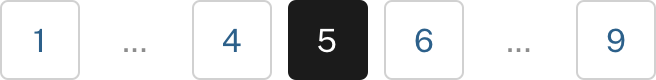
Default
unbounded
Default (Spanish)
unbounded (Spanish)
<h3 class="site-preview-heading">Default</h3>
<nav aria-label="Pagination" class="usa-pagination">
  <ul class="usa-pagination__list">
    <li class="usa-pagination__item usa-pagination__arrow">
      <a
        href="javascript:void(0);"
        class="usa-pagination__link usa-pagination__previous-page"
        aria-label="Previous page"
        ><svg class="usa-icon" aria-hidden="true" role="img">
          <use href="/assets/img/sprite.svg#navigate_before"></use>
        </svg>
        <span class="usa-pagination__link-text">Previous</span></a
      >
    </li>
    <li class="usa-pagination__item usa-pagination__page-no">
      <a
        href="javascript:void(0);"
        class="usa-pagination__button"
        aria-label="Page 1"
        >1</a
      >
    </li>
    <li
      class="usa-pagination__item usa-pagination__overflow"
      aria-label="ellipsis indicating non-visible pages"
    >
      <span>…</span>
    </li>
    <li class="usa-pagination__item usa-pagination__page-no">
      <a
        href="javascript:void(0);"
        class="usa-pagination__button"
        aria-label="Page 9"
        >9</a
      >
    </li>
    <li class="usa-pagination__item usa-pagination__page-no">
      <a
        href="javascript:void(0);"
        class="usa-pagination__button usa-current"
        aria-label="Page 10"
        aria-current="page"
        >10</a
      >
    </li>
    <li class="usa-pagination__item usa-pagination__page-no">
      <a
        href="javascript:void(0);"
        class="usa-pagination__button"
        aria-label="Page 11"
        >11</a
      >
    </li>
    <li
      class="usa-pagination__item usa-pagination__overflow"
      aria-label="ellipsis indicating non-visible pages"
    >
      <span>…</span>
    </li>
    <li class="usa-pagination__item usa-pagination__page-no">
      <a
        href="javascript:void(0);"
        class="usa-pagination__button"
        aria-label="Last page, page 24"
        >24</a
      >
    </li>
    <li class="usa-pagination__item usa-pagination__arrow">
      <a
        href="javascript:void(0);"
        class="usa-pagination__link usa-pagination__next-page"
        aria-label="Next page"
        ><span class="usa-pagination__link-text">Next </span
        ><svg class="usa-icon" aria-hidden="true" role="img">
          <use href="/assets/img/sprite.svg#navigate_next"></use></svg
      ></a>
    </li>
  </ul>
</nav>

<h3 class="site-preview-heading">unbounded</h3>
<nav aria-label="Pagination," class="usa-pagination">
  <ul class="usa-pagination__list">
    <li class="usa-pagination__item usa-pagination__arrow">
      <a
        href="javascript:void(0);"
        class="usa-pagination__link usa-pagination__previous-page"
        aria-label="Previous page"
        ><svg class="usa-icon" aria-hidden="true" role="img">
          <use href="/assets/img/sprite.svg#navigate_before"></use>
        </svg>
        <span class="usa-pagination__link-text">Previous</span></a
      >
    </li>
    <li class="usa-pagination__item usa-pagination__page-no">
      <a
        href="javascript:void(0);"
        class="usa-pagination__button"
        aria-label="Page 1"
        >1</a
      >
    </li>
    <li
      class="usa-pagination__item usa-pagination__overflow"
      aria-label="ellipsis indicating non-visible pages"
    >
      <span>…</span>
    </li>
    <li class="usa-pagination__item usa-pagination__page-no">
      <a
        href="javascript:void(0);"
        class="usa-pagination__button"
        aria-label="Page 9"
        >9</a
      >
    </li>
    <li class="usa-pagination__item usa-pagination__page-no">
      <a
        href="javascript:void(0);"
        class="usa-pagination__button usa-current"
        aria-label="Page 10"
        aria-current="page"
        >10</a
      >
    </li>
    <li class="usa-pagination__item usa-pagination__page-no">
      <a
        href="javascript:void(0);"
        class="usa-pagination__button"
        aria-label="Page 11"
        >11</a
      >
    </li>
    <li class="usa-pagination__item usa-pagination__page-no">
      <a
        href="javascript:void(0);"
        class="usa-pagination__button"
        aria-label="Page 12"
        >12</a
      >
    </li>
    <li
      class="usa-pagination__item usa-pagination__overflow"
      aria-label="ellipsis indicating non-visible pages"
    >
      <span>…</span>
    </li>
    <li class="usa-pagination__item usa-pagination__arrow">
      <a
        href="javascript:void(0);"
        class="usa-pagination__link usa-pagination__next-page"
        aria-label="Next page"
        ><span class="usa-pagination__link-text">Next </span
        ><svg class="usa-icon" aria-hidden="true" role="img">
          <use href="/assets/img/sprite.svg#navigate_next"></use></svg
      ></a>
    </li>
  </ul>
</nav>

<h3 class="site-preview-heading">Default (Spanish)</h3>

<nav aria-label="Paginación" class="usa-pagination">
  <ul class="usa-pagination__list">
    <li class="usa-pagination__item usa-pagination__arrow">
      <a
        href="javascript:void(0);"
        class="usa-pagination__link usa-pagination__previous-page"
        aria-label="Anterior página"
        ><svg class="usa-icon" aria-hidden="true" role="img">
          <use href="/assets/img/sprite.svg#navigate_before"></use>
        </svg>
        <span class="usa-pagination__link-text">Anterior</span></a
      >
    </li>
    <li class="usa-pagination__item usa-pagination__page-no">
      <a
        href="javascript:void(0);"
        class="usa-pagination__button"
        aria-label="Página 1"
        >1</a
      >
    </li>
    <li
      class="usa-pagination__item usa-pagination__overflow"
      aria-label="ellipsis indicating non-visible pages"
    >
      <span>…</span>
    </li>
    <li class="usa-pagination__item usa-pagination__page-no">
      <a
        href="javascript:void(0);"
        class="usa-pagination__button"
        aria-label="Página 9"
        >9</a
      >
    </li>
    <li class="usa-pagination__item usa-pagination__page-no">
      <a
        href="javascript:void(0);"
        class="usa-pagination__button usa-current"
        aria-label="Página 10"
        aria-current="page"
        >10</a
      >
    </li>
    <li class="usa-pagination__item usa-pagination__page-no">
      <a
        href="javascript:void(0);"
        class="usa-pagination__button"
        aria-label="Página 11"
        >11</a
      >
    </li>
    <li
      class="usa-pagination__item usa-pagination__overflow"
      aria-label="ellipsis indicating non-visible pages"
    >
      <span>…</span>
    </li>
    <li class="usa-pagination__item usa-pagination__page-no">
      <a
        href="javascript:void(0);"
        class="usa-pagination__button"
        aria-label="Última página, página 24"
        >24</a
      >
    </li>
    <li class="usa-pagination__item usa-pagination__arrow">
      <a
        href="javascript:void(0);"
        class="usa-pagination__link usa-pagination__next-page"
        aria-label="Siguiente página"
        ><span class="usa-pagination__link-text">Siguiente </span
        ><svg class="usa-icon" aria-hidden="true" role="img">
          <use href="/assets/img/sprite.svg#navigate_next"></use></svg
      ></a>
    </li>
  </ul>
</nav>


<h3 class="site-preview-heading">unbounded (Spanish)</h3>
<nav aria-label="Paginación," class="usa-pagination">
  <ul class="usa-pagination__list">
    <li class="usa-pagination__item usa-pagination__arrow">
      <a
        href="javascript:void(0);"
        class="usa-pagination__link usa-pagination__previous-page"
        aria-label="Anterior página"
        ><svg class="usa-icon" aria-hidden="true" role="img">
          <use href="/assets/img/sprite.svg#navigate_before"></use>
        </svg>
        <span class="usa-pagination__link-text">Anterior</span></a
      >
    </li>
    <li class="usa-pagination__item usa-pagination__page-no">
      <a
        href="javascript:void(0);"
        class="usa-pagination__button"
        aria-label="Página 1"
        >1</a
      >
    </li>
    <li
      class="usa-pagination__item usa-pagination__overflow"
      aria-label="ellipsis indicating non-visible pages"
    >
      <span>…</span>
    </li>
    <li class="usa-pagination__item usa-pagination__page-no">
      <a
        href="javascript:void(0);"
        class="usa-pagination__button"
        aria-label="Página 9"
        >9</a
      >
    </li>
    <li class="usa-pagination__item usa-pagination__page-no">
      <a
        href="javascript:void(0);"
        class="usa-pagination__button usa-current"
        aria-label="Página 10"
        aria-current="page"
        >10</a
      >
    </li>
    <li class="usa-pagination__item usa-pagination__page-no">
      <a
        href="javascript:void(0);"
        class="usa-pagination__button"
        aria-label="Página 11"
        >11</a
      >
    </li>
    <li class="usa-pagination__item usa-pagination__page-no">
      <a
        href="javascript:void(0);"
        class="usa-pagination__button"
        aria-label="Página 12"
        >12</a
      >
    </li>
    <li
      class="usa-pagination__item usa-pagination__overflow"
      aria-label="ellipsis indicating non-visible pages"
    >
      <span>…</span>
    </li>
    <li class="usa-pagination__item usa-pagination__arrow">
      <a
        href="javascript:void(0);"
        class="usa-pagination__link usa-pagination__next-page"
        aria-label="Siguiente página"
        ><span class="usa-pagination__link-text">Siguiente </span
        ><svg class="usa-icon" aria-hidden="true" role="img">
          <use href="/assets/img/sprite.svg#navigate_next"></use></svg
      ></a>
    </li>
  </ul>
</nav>Guidance
When to use the pagination component
-
Search results. Pagination is most commonly used with paginated search results. Our Pagination component is designed to work both with results that have a discrete number of results pages (bounded) and those with an uncalculated number of results pages (unbounded). See Using the Pagination component, below, for more on bounded and unbounded sets.
-
Multi-page collections of related items. Splitting a large collection of related items into individual pages can improve browsability and scannability. Common examples of multi-page collections include articles related to a category or tag, content archives, and history or activity.
When to consider something else
-
Meaningful page groupings. If you have long content split meaningfully, or grouped by subject or theme, use conventional navigation like Side navigation.
-
Steps in a sequence. If you need to indicate progress in a series of steps that must be completed in succession, like an onboarding flow, consider using the step indicator component.
-
Short collections. If the length of the entire collection is less than 3-4 screen lengths long, consider showing all the items at once instead of paginating.
Usability guidance
-
Show the size of the paginated set. Users want to know the length of a paginated section. This is most commonly accomplished by always showing the last page as the last item in the pagination navigation. Users should also know if the set is unbounded and has no discrete length. For example, some large search results will not have a “last” page. The USWDS Pagination component will always show the last page of the set as a navigable link, or show an ellipsis at the end of the links if the set is unbounded.
-
Highlight the current page. Pagination shows the current page the user is on in relation to the entire collection of pages.
-
Always include the first, previous, and next pages. Users should always be able to navigate to each of these pages from any page in the set.
-
Show navigation items in a single line. Pagination can be hard to understand — and individual items can be more difficult to select — when the items break over one line. Don’t split the navigation items over multiple lines. Avoid using Pagination in any context where it would be more than one line long.
- Indicate any missing pages. Don’t include out-of-sequence items directly adjacent to one another. Whenever there are pages missing — either between two elements, or at the end of an unbounded sequence — indicate the missing pages with an indicator like a non-selectable ellipsis.
- Use as few navigation items as possible. Showing more pages than necessary tends to add complexity and use more space without proportional increases to the component’s functionality. Focus on the essential actions and avoid adding more items to Pagination just to fill space.
- Use generous touch targets. Use touch targets that are big enough to select with any finger and have enough separation to avoid mistakes.
- Optimize the number of entries per page. Consider page load, performance, and the user’s scrolling preferences when determining how many items are displayed on each page. Some paginated content benefits from user control over the number of elements to show on each page.
Accessibility guidance
-
Use the
<nav>element. Use a wrapping<nav>element to identify Pagination as a navigation section to screen readers and other assistive technologies. -
Use a unique, descriptive ARIA label for the <nav> element. Provide a descriptive ARIA label for any Pagination component’s
<nav>element that describes its purpose. For example, if the pagination component is used to navigate through a set of search results, an appropriate label could bearia-label="search results page". If you use more than one Pagination component on a page, each will need a unique ARIA label. -
Use an unordered list for the navigation items. This allows screen readers to voice the number of elements in the Pagination component
- Voice the current page. Use
aria-current="page"on the current page’s link item to properly voice the current page for screen readers. - Voice the word “page” before the page numbers in links. Use
aria-label="page [#]"on each page link to be explicit that the numbers are links to page numbers. - Voice “last page” on the last page’s link in a bounded set. Use
aria-label="last page, page [#]"to voice that the last element in the navigation is the last page in the paginated section. Don’t include this on the last navigation element in an unbounded set, since there is no last page in an unbounded set. - Use a link for the current page for robustness. While it may sound counterintuitive to link to the current page in your Pagination component, it makes sense to include this as a link so screen readers voice the current page whether the user navigates by element or by tabbing.
- Avoid large horizontal gaps between elements. Users with limited vision or mobility may stop scanning and miss an element if there’s too much horizontal space between it and the previous element in the reading order.
Using the pagination component
Unlike many USWDS components, Pagination includes behaviors we cannot build into the HTML, CSS, and JavaScript we ship with the design system. Developers will need to build these behaviors into their Pagination templates. We’ve outlined these behaviors below, and included them in the Twig templates for Pagination in our source code.
- Set the current page item. Use the
usa-currentclass to highlight the currently active page. - Pair with the Collection component. To display related items like articles or events in a compact list, consider using Pagination with the Collection component, which offers short descriptions and then directs users to the original source.
- Bounded and unbounded sets. The USWDS Pagination component is designed to work with both paginated sets that have a discrete number of pages (most paginated content) and those that do not. Bounded sets have a discrete number of pages and each page is potentially equally relevant (such as a set of blog posts sorted chronologically). Unbounded sets (often returned as a search result) are large sets sorted by relevance, where deeper pages have less relevance. Unbounded sets show no last page.
Behaviors
Pagination is navigation for paginated content. Taken as a whole, we call this paginated content a set. Each item in the set is a page and the page the reader is on is the current page.
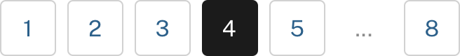
The Pagination component includes seven equal-sized, equally spaced slots arranged in a single horizontal line. Each slot can accept a navigation item (typically a link to a specific page) or an overflow indicator (we use an ellipsis) to indicate that there are pages we're not showing. In the behaviors below, we'll number the slots 1–7, from left to right.
General component properties
- The component features a maximum of seven slots.
- Each slot can contain a navigation item or an overflow indicator.
- The first slot is always the first page of the set.
- If there are fewer than seven pages in the set, show only that number of slots.
- The component should always show the first page and current page.
- Show the next page, previous page, and last page if those pages exist.
- Display the same number of slots for each page in the set.
Pagination behaviors
-
Remove extra slots if there are fewer than 7 pages.

-
Always highlight the current page.

-
Hide the
Previouslink on the first page of the set and hide theNextlink on the last page of the set.


-
Always show both the previous page and the next page adjacent to the current page.
-
Show an overflow indicator when there are pages missing.

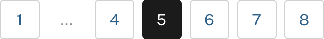
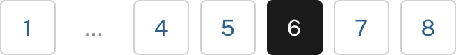
-
Bounded sets can show overflow indicators in Slot 2 and Slot 6 only.
-
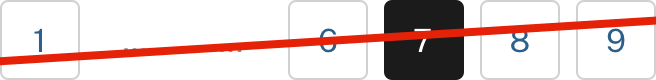
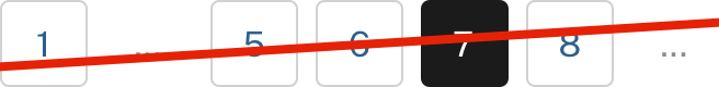
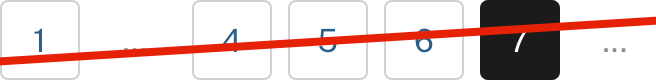
Unbounded sets always show an overflow indicator in Slot 7.

-
Unbounded sets use Slot 4 as the current page for pages 4 and higher.


Pagination settings
| Variable | Description |
|---|---|
$theme-pagination-background-color
|
The background color of the entire pagination component. |
$theme-pagination-breakpoint
|
Breakpoint at which full pagination displays. |
$theme-pagination-button-border-radius
|
Default pagination button border radius. |
$theme-pagination-button-border-width
|
Width of button border. |
$theme-pagination-font-family
|
Default font family for pagination. |
Pagination variants
This component has no variants.
Accessibility test status
The USWDS team did 10 tests based on WCAG 2.1 AA success criteria.
| Total tests |
Passed
|
Passed with exceptions
|
Conditional
|
Failed
|
|---|---|---|---|---|
| 10 | 8 | 0 | 2 | 0 |
Overview of recent accessibility test results:
Learn more on the pagination accessibility tests page.
Package
-
Package usage:
@forward "usa-pagination"; - Dependencies:
uswds-fonts
Latest updates
Meaningful code and guidance updates are listed in the following table:
| Date | USWDS version | Affects | Description |
|---|---|---|---|
| 2024-12-18 | 3.11.0 |
|
Replaced deprecated |
| 2024-10-16 | N/A |
|
Added WCAG compliance tag and accessibility test status section. More information: uswds-site#2865 |
| 2024-10-04 | 3.9.0 |
|
Added text underline styles to pagination links. Pagination links are now visually consistent with other USWDS text links. More information: uswds#5970 |
| 2023-08-23 | 3.6.0 |
|
Breaking
Updated styles to respect the value of |
| 2023-08-23 | 3.6.0 |
|
Updated the ellipsis color to meet color contrast requirements. More information: uswds#5358 |
| 2023-06-09 | 3.5.0 |
|
Improved legibility in forced colors mode. Adds a consistent border in forced colors mode. More information: uswds#5147 |
| 2023-06-09 | 3.5.0 |
|
Improved accessible markup of overflow ellipses.
We replaced the |
| 2022-04-28 | 3.0.0 |
|
Breaking Updated to Sass module syntax and new package structure. More information: uswds#4656 |
| 2022-04-11 | 2.13.3 |
|
Added support for forced colors mode. All our components now support proper display when users have a forced colors mode set in their operating system. More information: uswds#4610 |
| 2021-06-16 | N/A |
|
Added pagination documentation. More information: uswds-site#1218 |
| 2021-06-16 | 2.12.0 |
|
Added pagination component. Pagination is navigation for paginated content. More information: uswds#4175 |