
Design tokens
Using color
Color is a practical and emotional tool. It conveys personality, sets a tone, attracts attention, and indicates importance.
Introduction
USWDS organizes its color tokens into theme tokens, state tokens, and System tokens. System tokens are the complete set of colors available from USWDS. Project tokens are a smaller, role-based subset customized to your project’s individual identity, tone, and needs. This subset of tokens will use only a few color families from the 24 color families available in the set of System tokens.
Use USWDS color tokens, and avoid custom colors whenever possible. Creating coherent government sites and services helps provide a good user experience to the public. Of course, your mission, project needs, and user needs always come first, but if you plan to contribute your work back into the system — which helps the system learn, adapt, and improve — that work will need to conform to system standards and use USWDS’s design tokens.
Color, color family, and grade
Throughout our documentation and guidance, we’ll use the terms “color,” “color family,” and “grade” — but what do we mean when we use them?
Color is any specific swatch in our system color token palette, like red-50, green-cool-10, or indigo-warm-60v.
Color family is a group of colors that all have the same hue on a color wheel (refer to USWDS color wheels). Each contains a number of individual colors, distinguished from each other by the brightness or saturation. A System token’s color family typically has a conventional color name, like red or blue-warm, and a theme token’s color family has a role-based name, like primary.
Grade is a way to express how light or dark a color is. USWDS uses a 100-point scale to communicate a color token’s grade, where 0 is pure white and 100 is pure black. We’ve regularized these grades across color families; a color of grade 50 in one color family should be the same level of lightness as a color of grade 50 in another color family. This feature of USWDS has important color-contrast and accessibility implications, which we discuss in the subsequent sections on accessibility.
Color and accessibility
Color is a powerful tool with an unreliable impact — its effects are neither consistent nor predictable across a population. Per NIH, color insensitivity impacts approximately 0.5% of adult women and 8% of adult men (4.5% of the total population). Color insensitivity can make it difficult to distinguish hues (red–green color blindness is the most common form), and some rare conditions prevent the perception of hue altogether. Commonplace vision problems like nearsightedness and astigmatism (among others) also affect how well folks perceive color and contrast.
Accessibility is not a special case. In the second quarter of 2018, sites using USWDS topped 1.4 billion pageviews. 4.5% of 1.4 billion is around 60 million pageviews — when it comes to accessibility, thinking broadly and inclusively isn’t just a good idea, it’s our mission and responsibility.
Section 508, which aligns with WCAG 2.0 Level AA, sets the legal standard for the needed contrast level between text and its background. The baseline AA contrast standard is 4.5:1 for most text and 3:1 for large text (19px+ bold or 24px+ normal text).
Accessible color pairings
USWDS helps teams choose accessible colors with a color-grade system. The following figure represents the gray color family in grades 5–90:
Each color family has 10 grades, which fall between 5 and 90. Pure white is the equivalent of grade 0, and pure black is the equivalent of grade 100.
Magic number
We call the difference in grade between any two colors the magic number. Magic numbers have the following contrast implications:
- A magic number of 40+ results in WCAG 2.0 AA Large Text contrast (example:
gray-90andindigo-warm-50v). - A magic number of 50+ results in WCAG 2.0 AA contrast or AAA Large Text contrast (example:
gray-90andred-40). - A magic number of 70+ results in WCAG 2.0 AAA contrast (example:
gray-10andred-80). - Colors of grade 50 result in Section 508 AA contrast against both pure white (grade
0) and pure black (grade100).
Use magic numbers to choose accessible color combinations from any palette and color family.
Magic numbers work because each grade conforms to a specific range of values for relative luminance. WCAG and Section 508 color contrast is calculated as a ratio of the relative luminances of two colors, so as long as our colors fall between a specific luminance range for each grade, the ratio will conform to contrast requirements. The following table shows each grade and the corresponding luminance minimum and maximum.
| grade | minimum luminance | maximum luminance |
|---|---|---|
0 |
1.000 |
1.000 |
5 |
0.850 |
0.930 |
10 |
0.750 |
0.820 |
20 |
0.500 |
0.650 |
30 |
0.350 |
0.450 |
40 |
0.225 |
0.300 |
50 |
0.175 |
0.183 |
60 |
0.100 |
0.125 |
70 |
0.050 |
0.070 |
80 |
0.020 |
0.040 |
90 |
0.005 |
0.015 |
100 |
0.000 |
0.000 |
Accessible color combination examples
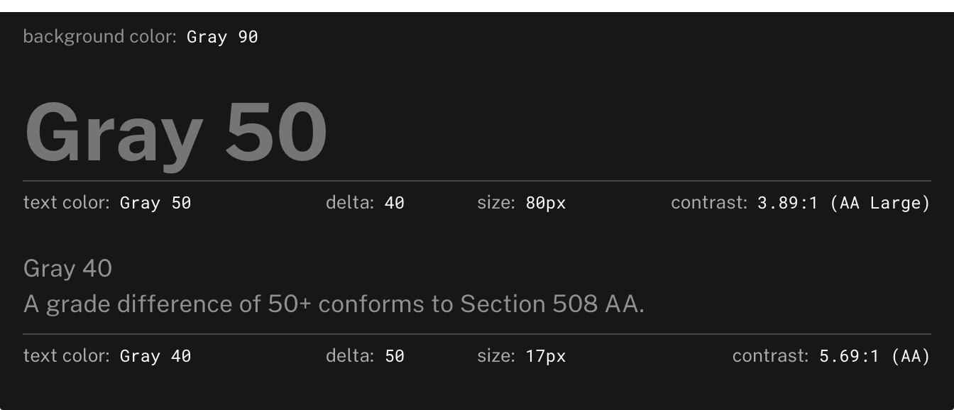
The following two images are examples of accessible color combinations. In this first image, the background color is gray-90. To get a magic number of at least 50 and, thus, ensure a Section 508 AA contrast level, the text color must be grade 40 or below. Grades of 50 and below would be acceptable for large text.
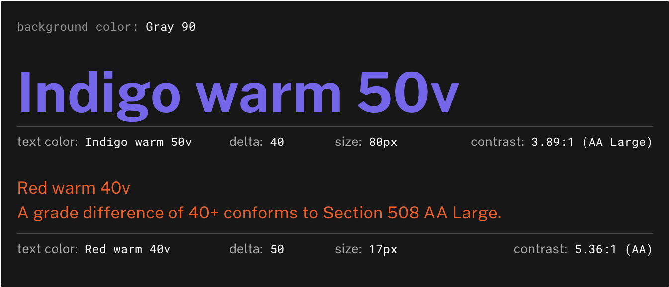
The color grade system works across color families as shown in this second image.
Color, contrast, and readability
Readability is the ease with which a reader can understand a written text. It’s a complicated phenomenon affected by many factors in addition to color and contrast, including (but not limited to) type size, typeface, line length, line height, whitespace, word choice, content design, and writing style. Readability issues can be especially important for sites that contain documentation or detailed text that requires concentration.
When it comes to color, consider these general guidelines:
- Section 508 AA+ color contrast helps colorblindness and color perception.
- Avoiding pure black text on a white background helps dyslexia, Irlen Syndrome, light sensitivity, and autism.
- The best combination is the maximum color contrast of white or light text on black or dark background because it seems to visually work well for all.
- The best option, when possible, is to provide a way for users to select their own text and background colors.
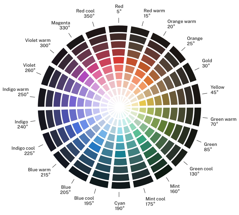
USWDS color wheels
The following color wheels are a way to visualize the entire System palette and its color-family naming rubric. The color wheels are arranged around the 360 degrees of the HSL color model. Each color family is labelled with its position (in degrees) on this model. In general, colors within color families stay close to the hue value listed, but it is a custom palette, not generated by an algorithm. Hue variation within color families is intentional — we are trying to find good colors, not just those that fit a function.
The following image shows our standard System tokens wheel.
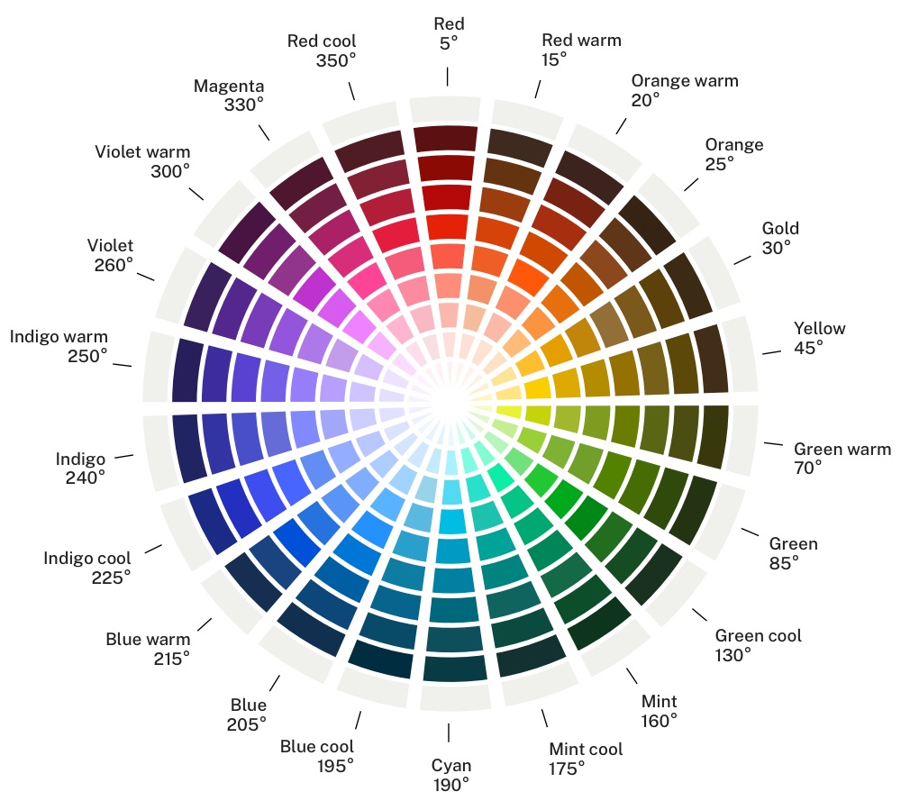
The following image shows our vivid System tokens wheel.
General color guidance
If we use color intentionally, consistently, and sensitively, it can make a big difference in the way people understand and connect with our pages, our products and services, and our message. Color is an important component of visual and emotional cognition, and that’s precisely what makes it difficult to use well — what’s strong and confident to one person can be jarring or alarming to another.
Start in black and white. Start with your core message and use type scale and hierarchy to test and refine its effectiveness. Then, introduce color to support that message. Color can overwhelm interpretation, and since approximately 4.5% of the population has some kind of color insensitivity, it’s important to convey your message without relying on color.
Put the practical before the emotional. Because color can do so much, it’s helpful to keep focused. Limit the complexity of color by concentrating on functional requirements (like status states or directions) first. Then, use color as progressive enhancement to reinforce or balance the emotional needs of the content. Even so, bear in mind that the effects of color are often personal and cultural as much as, or more so than, physiological. Understand that using color to optimize for tone necessarily excludes some users in subtle and not-so-subtle ways.
Use mood boards for guidance. Deriving appropriate color palettes can be challenging, and letting existing colors and palettes be your guide makes sense. Collect images from other sources that evoke the desired tone to find commonalities. Then, find close matches in the system palette to help build your theme.
Ask visual designers. Your group or agency may have visual designers either on staff or available as contractors. They can be an invaluable resource for building palettes or getting feedback on existing ones. USWDS benefits from the collective experience of visual designers across agencies to build our System palette and provide a range of prebuilt project theme palettes. If you have visual design resources, use them.
Don’t use color exclusively to convey meaning. Even Section 508 conformant contrast doesn’t ensure that colors are distinguishable for a significant percentage of your audience. Approximately 0.5% of adult women and 8% of adult men have some kind of color insensitivity, especially between red and green. Color should only be used as progressive enhancement — if color is the only signal, that signal won’t get through as intended to everyone.
Further reading
- Accessibility: Color and contrast https://digital.gov/guides/accessibility-for-teams/visual-design#color-and-contrast
- Color and readability https://www.w3.org/WAI/RD/2012/text-customization/r11
- Improving accessibility for colorblind users https://www.smashingmagazine.com/2016/06/improving-color-accessibility-for-color-blind-users/
- Introduction to Irlen Syndrome https://irlen.com/what-is-irlen-syndrome/
- Making content accessible for those with dyslexia https://www.dyslexic.com/blog/quick-guide-making-content-accessible/
- W3C: Contrast levels for readability https://www.w3.org/WAI/test-evaluate/preliminary/#contrast
- W3C: Gap analysis of the state of accessibility for people with learning disabilities and cognitive disabilities https://www.w3.org/TR/coga-gap-analysis/
- W3C: Low vision needs https://www.w3.org/TR/low-vision-needs/
Tools
- USWDS Color Tool from CivicActions: Convert any hex color into its closest USWDS equivalent https://civicactions.github.io/uswds-color-tool
Latest updates
Meaningful code and guidance updates are listed in the following table:
| Date | USWDS version | Affects | Description |
|---|---|---|---|
| 2022-06-03 | N/A |
|
Updated the minimum luminance for color grade 40. More information: uswds-site#1631 |
| 2021-12-29 | N/A |
|
Added tools section. More information: uswds-site#1276 |